Jul 28, 2016

1940-1941 Packards: Tradition's Last Stand

Packard was America's leading luxury automobile brand before, during (especially), and for a while after the 1920s.  All premium brands were hit hard by the Great Depression of the 1930s, but Packard was able to survive.  In part, this was because it added a more mid-range model, the One-Twenty, in 1935 and then went further mid-range with its Packard Six (later 110).  The price the company paid for its survival into the 1940s was a lessening of the brand's prestige.

While becoming more competitive with Buick than with Cadillac, Packard made sure to retain its highly distinctive grille design on all its models from the lowly Six to its luxury V-12 line (dropped after the 1939 model year).

But a price had to be paid here too.  While competing brands began to feature more streamlined  looking front ends and horizontal rather than vertical grill formats, Packard's retention of traditional details made its cars increasingly old-fashioned looking.  Finally in the spring of 1941 Packard introduced its non-traditional Clipper whose body became the standard for all 1942 model year Packards.

The images below show some 1940 and 1941 pre-Clipper Packards along with competing Buicks that were far more up-to-date styling-wise.

Gallery

1940 Packard One-Twenty Sport Sedan - Barrett-Jackson photo
The body shown here dates from the 1938 model year.  Due to Packard's styling conservatism, the area from the front axle line aft is no more advanced than the same parts of General Motors' 1935 Pontiacs and LaSalles.

1940 Buick
The body on this Buick was new for 1940.  The grille's layout is becoming horizontal, and door hinges are now hidden by body panels, as is the running board.  Its overall appearance is sleeker than the Packard's in the previous photo.  The most out-of-date feature is the positioning of the headlights; they are not quite fully integrated into the front fenders.  GM was slow to follow other brands in this regard even though it otherwise was the auto industry style leader in those days.
The 1940 Packard has exposed running boards and free-standing headlights, not to mention exposed door hinges and that tall grille.

1941 Buick
Buick's 1941 facelift finally integrated headlights into the fenders.

1941 Packard One-Twenty Sedan - Auctions America photo
Meanwhile, Packard had its own facelift that gave the old body style better front-end integration.  The front fenders were restyled and the catwalk raised to blend with them.  Headlight integration is about on par with the 1940 Buick, nevertheless a significant modernization from the previous Packard.  Speed stripes on the fenders are in line with current styling fashions.  The rest of the body looks old-fashioned compared to the Buick.

1941 Packard One-Twenty Sedan - Vaultcars sales photo
The extreme rear part of this Packard is not far out of line from 1939-40 competing brand styling.  But by 1941 several other makes were featuring streamlined-looking "fastback" designs.

1941 Packard One-Sixty Touring Sedan - sales photo
Here is a side view of a Packard One-Sixty, a luxury level Packard.  Despite the various old-fashioned (for 1941) details, I can see that a car such as shown here would appeal to a rich, conservative clientele not quite ready to buy a more trendy '41 Cadillac.

Jul 25, 2016

Toyota Prius Evolution: From Plain to Rococo

Toyota's Prius was the first successful (in the marketplace) hybrid-powered car in America.  As of now, it has gone through four design generations, the first of which I treated here.

The first Priuses were stubby and nondescript.  They might be considered a proof-of-concept design rather than a car more closely tailored to the automobile market.

It was the second-generation Prius that defined the brand.  Its body was given thorough wind tunnel testing that resulted in a basic shape that remains little changed.  What has changed over time are secondary, ornamental details.  The most recent Prius is a victim of Toyota's recent new styling policy moving from bland to ostentatious appearance for its various car and SUV models.

The comparative-image sets below have the second-generation (2004) Prius at the top followed by third generation (2010) and current (2016) generation examples.

Gallery

First-generation Prius
As I mentioned in the post linked above, the nose of the car is poorly related to the rest of the body.

Front Quarter Views


The second-generation Prius was a simple, clean design.  It was followed by a design with details giving the car a stronger wedge-shaped look than its basic shape actually warrented.  This can be seen in the treatment of the side windows and the character crease below their sills.  Current Priuses are decorated by fashionable spikes and other angular treatments of light assemblies, air openings and sheet metal in general.  One result is a return to the first-generation Prius' defect of the front end not being very well related to the rest of the car, a problem not found in generations two and three.

Side Views


Profiles of Priuses have changed subtly over the last three generations.  The second-generation car had a lower hood line and no aerodynamic spoiler at the rear.  The hood was raised for the third-generation car, probably in response to European regulations.  The current Prius has a rear spoiler as well as the Euro hood line.  Another difference is the roof curve.  Second and fourth generation cars have the roof peaking near the driver's head, whereas the third-generation cars have the high point noticeably farther aft.

Rear Quarter Views


Rear styling of second and third generation Priuses can be characterized as basically functional, though the second-generation car is more successful in this regard.  Current Priuses have highly contrived rear-end detailing.  The spiky tail light assemblies seem to dictate the body sculpting rather than the reverse.  So far as I am concerned, Prius styling is now a fashionable mess.

Jul 21, 2016

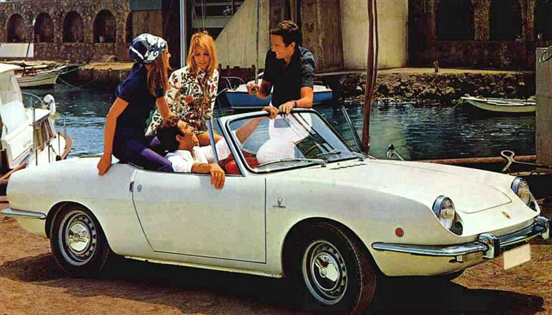
Cute: Giugiaro's Fiat 850 Spider

The Fiat 850  line (produced 1964-73) was comprised of its basic sedan, a sporty coupe and a convertible called the Spider ("Speeder").  The latter's body was a Bertone design and product, the designer being the now-famed Giorgetto Giugiaro who worked at Bertone early in his career.

The 850 Spider was small and underpowered, an impractical car for long-distance touring due to lack of luggage space.  On the other hand, it was nicely styled.  Being a tiny car, Giugiaro chose, consciously or otherwise, to have it look cute rather than pretentious.  He also was able to avoid being forced to decorate a cheap concept such as was the case of the Austin-Healey Sprite I wrote about here.

Gallery

To set the scene, here is a 1967 850 Spider's sales photo.

I don't know the source of this phantom illustration, though it looks like it was scanned from a book or magazine.  The Spider had plenty of overhang at the front, something common on front-wheel drive cars.  But the Spider's motor was in the rear and the frontal space was occupied by the spare tire and a small trunk.  This overhang, not present on other 850s, allowed Giugiaro to craft a longer, more graceful shape.

The Spider's graceful lines are apparent in this publicity photo.  An important detail is the headlight design which enhanced the cute appearance of the car.  The bumpers are quite flimsy by today's standards, but necessary for the design theme.  Note the subtle character fold along the side.

Rear view of a Spider for sale.  There are two lids at the rear, the forward one for the top and the other for engine access.  This shows how the character fold ties into the tail light ensemble.  The wire wheels on the slightly too-small wheels are probably not stock.

Part-way into the Spider's production run the headlight design was altered, probably due to government regulation in the USA and perhaps elsewhere.  This detail change largely destroyed the "cuteness" of Giugiaro's design.

Jul 18, 2016

Nissan's Fad-Filled Maxima

According to this source, Nissan's Maxima brand has been around since 1981 and is now in its eighth version that was introduced for the 2016 model year.

Styling for the new Maxima was previewed by a 2014 concept car that I wrote about here regarding its visually disconnected roof that I and design critic Robert Cumberford approved of at the time.  Now that the design has reached production I'm beginning to worry that the "floating roof" (as Cumberford referred to it) might be yet another styling cliché on its way, because Nissan is using the same motif on its 2016 Murano (I posted on it here), and some think like it can be seen on the 2016 Lexus RX.

As for the Maxima's overall styling, it's yet another fussy, over-decorated example of current styling fashion.  In recent years, Maximas have been face-lifted Nissan Altimas.  Sometimes the alterations are improvements, other times not.  For 2016, my vote is for the "not" side.

Gallery

Front three-quarter view of a 2016 Nissan Maxima.

And here is a 2016 Nissan Altima for comparison.  The cars share a front-end theme, though details differ.  Note that they also share front fenders as far back as the the front door cut line, a nice way to save a few yen on tooling costs.  Thereafter, the side sculpting differs.  The Maxima features more elaborate sculpting on and aft of the rear door.

Now for some views featuring side and rear design.  This photo emphasizes sleekness.  That said, I find the nib-shape belt line shape in the zone above the rear wheels too massive.  It seems to be an attempt at a new Nissan brand identifier as it is also found on the 2016 Nissan Murano crossover SUV.

The rear is less fussy than the front and sides, though the notch on the outer side of the tail light assembly adds to the unnecessary busyness found elsewhere.

The black divider between the roof and sides seems smaller that it needs to be, though it does fit into the scheme introduced by the "nib" feature mentioned above.  I would try eliminating or considerably shrinking the nib and reworking the trunk lid while incorporating a larger (but not too large!) black separation feature.

Jul 14, 2016

Ford Société Anonyme Française's Comète

The Comète was produced 1951-54 by Ford Société Anonyme Française, its body built by Metallon Facel.  It was passed on to Simca when Ford SAF was folded in 1954.  I find it interesting that Simca had a similar-looking car at about the same time called the Simca Sport that I wrote about here.  It seems that the Simca Sport body was also farmed out to Facel.

The best I can find for now regarding Comète's styling is a short passage by René Bellu in Automobilia Hors-Serie No. 20 "Touts les voitures française 1952, Salon 1951."  Bellu stated:

Les origines de cette jolie voiture remontent au début de 1951, lorsque François Lehideux a envisagé d'ajouter un coach luxueux à sa gamme des Vedette pour lesquelles il n'éproue pas une grande sympathie.  Le projet initial vient de Turin, plus exactment de Farina qui a soumis des plans à Poissy au printemps avant que la fabrication des premiers prototypes soit confiée à Jean Daninos.  La préparation des Comète d'avant-série devait s'effectuer avec une extrême discrétion, ceci à la demande expresse de M. Lehideux qui souhaitait, bien sûr, provoquer la plus grande surprise possible lors de la présentation officielle mais qui voulait surtout se prémunir d'eventuelles pressions de la direction américainne de Ford; pour cette raison, même les cadres supérieurs de Poissy ignoraient l'existence de la future Comète.

Outre sa silhouette élegante et ses proportions judicieuses, la Comète se singularise par sa forme « ponton » que Farina a parfaitement maîtrisée.  Sa présentation intérieure cossue et la grand soin de la finition s'ajoutent à l'esthétique pour hisser la Comète parmi les voitures françaises les plus séduisants... pour un prix somme toute très raisonnable.

It seems that the Simca Sport was styled by Pinin Farina.  And the Farina mentioned by Bellu is almost certainly Pinin and not Stabilimenti Farina, a coachbuilder that ceased doing business in 1953.  So these two similar cars whose bodies were built by the same firm apparently had styling from the same source.  Was there any coordination?  Or did the Simca Sport's existence inspire the relevant people at Ford SAF?  The cabriolet version of the Sport was introduced at the 1948 Salon de Paris and the coupe the following year.  The Comète was revealed to the press 17 August 1951, so the inspiration hypothesis makes some sense.  Yet the use of the same stylist and body maker, along with similar appearance makes me wonder if there was some coordination.  I'm sure there is a source someplace with the needed information, but it's not at my fingertips.

For general information on the Comète, its English Wikipedia entry is here.  The French entry has little detail for some reason.

Gallery

1952 Simca 8 Sport
This is a facelift of the original design, the major change being a bolder grille.  The Sport seats two people, whereas the Comète has room for four.  Another difference is that the Sport has a distinct rear fender, not a full-length "pontoon."

1952 Comète
Bellu's enthusiastic comments are well-justified.  I wonder if the central element in the grille is a nod to the "spinner" theme on American Fords of the early 1950s.

Side view.  The rear seat area looks pretty cramped.

Styling is classical late-1940s - early-1950s Italian.  The three-piece panoramic backlight and the bold grille bar are the only American touches.

Front view of the Cométe and of a model who, for some reason, does not seem happy.

Jul 11, 2016

Similar Aft: Ford Fusion and Chrysler 200

A year ago I posted regarding how the need for wind-tunnel testing for reasons of fuel economy has resulted in cars with highly similar profiles.  One result of this similarity is increasingly baroque sheet metal ornamentation along with a fad regarding angular shapes for headlight and tail light assemblies.

Even such detailing can wind up surprisingly similar for cars from different makers.  Here we consider the rear aspects of Ford's Fusion and Chrysler's 200.

2014 Ford Fusion

2015 Chrysler 200

To me, the Fusion and 200 look pretty much the same at first glance.  Aside from the similar basic body shape, we see that the side and rear window shapes are nearly identical, as are those lips at the lower edge of the bumper / strike panels.

Remaining design features differ in detail, but not by much: they are styled in the same spirit.  These details include the shape of the tail light assemblies, the lower side character shapes extending aft of the rear wheel openings and the depression where the license plate is housed.  The Chrysler has less sculpting at the top of the trunk lid and alongside the backlight, but these are minor in the context of overall appearance.

Jul 8, 2016

Cadillac XLR: A Flat, Short-Lived Sports Car

General Motors' Cadillac Division marketed (1987-1993) a Pininfarina-designed sports car called the Allanté.  I wrote about it here.  The Allanté was not a sales success.   Undaunted, and seeking to reposition the brand's failing image, Cadillac management decided to launch another sports car for the 2004 model year, this time embodying the brand's new Art and Science faceted styling theme.

The new sports car was called the XLR (Wikipedia entry here).  It was marketed over the 2004-2009 models years with modest success.  GM's bankruptcy might have been a factor in its demise, but slow sales and the fact that it was based on an old (1997-2004 Corvette C5) platform were equally likely factors.

Given the constraints of the C5 layout and the angular, faceted Art & Science styling theme, Cadillac stylists did about as well as might be expected.  That is, the XLR in my opinion was not a styling success.  Seen on streets and highways, XLRs have the appearance of a flattened, almost Roman style brick.  I don't think sports cars should look like bricks.

Gallery

1997 Corvette C5 group
A collection of C5 Corvettes to illustrate what Cadillac stylists had to work with.

2004 Cadillac XLR - front 3/4 view
Most publicity photos of XLRs are shot from an unnaturally low point of view (see images below).  I include this photo because it is taken from something close to normal eye-level.  Compare to the Corvettes in the previous image.

2005 Cadillac XLR - front 3/4 sales photo
The grille / front ensemble is nicely done, combining Cadillac themes and the low body.  But see how flat the hood is.

2004 Cadillac XLR - rear 3/4 view
A somewhat flattering photo due to the camera position.  It makes the car seem taller and less flattened than it actually is.

2005 Cadillac XLR - side view
In profile, the XLR shows off its slightly wedged appearance.  Room is needed at the rear for luggage and the retractable top.  The hood line is so low that the front wheel openings create a pinched fender area above them despite being slightly offset by the thick lips of the openings.

2005 Cadillac XLR Euro - rear view
The trunk top, like the hood, is nearly flat.  With the top raised and given the shallow Vs of the bumper, license plate ensemble, and especially the central brake light, the trunk comes very close to having a dished-in appearance.  I would have been tempted to either slightly raise or lower the rear fenders and tail lights to offset the effect of the broad, nearly-flat plane.  Other small deviations from a brick-shape also might have helped the design.