Feb 2, 2017

1968 AMC Javelin

The mid-to-late 1960s saw the rise of the American "pony car," an allusion to the highly successful Ford Mustang introduced in April 1964.  It was followed by the Plymouth Barracuda, Chevrolet Camaro and this post's feature sporty automobile, American Motors' Javelin.  Its Wikipedia entry notes that there were two "generations," over the 1967-1974 production span.  The first was sold model years 1968-70, the second, actually a major facelift and not a true generational change, was marketed 1971-74.

Early Javelins were better looking than the facelifted ones.  They also were more attractive than the first Barracudas and all contemporary Mustangs.  I even think Javelins had an edge on Camaros due to the latter's Chevy II-dictated proportions.  I briefly discussed first-generation Camaros here.

Gallery

Vinyl covered tops were popular in the USA from the mid-1960s through the 1970s and even beyond, so many Javelins had them.

This is one of two images in this set showing a Javelin sans-Vinyl.  It is a fine-looking car aside from the slightly too-small wheels.

Side view.

AMC styling director Richard Teague spent most of his career working for car makers with limited budgets.  Beside ability and good taste, might that  discipline have helped him direct the creation of a number of good designs?  The Javelin front end is nicely handled, aided by the fact that government regulations regarding bumper protection were a few years in the future.

Another looking-down view.

This rear view shows how the roof is sail-panel blended into rear fender tops, creating a slightly sunken back window and trunk lid.  Paradoxically, I get the impression that this lessens visual bulk at bit.  The rest of the aft ensemble is very clean, again aided by less-crashworthy bumpers.

Jan 30, 2017

Isotta Fraschini's Failed Postwar Return

The Isotta Fraschini firm stopped building its line of luxury cars in 1934, only to attempt a revival after World War 2.  The English language Wikipedia entry is here, but better-referenced versions are in French and Italian and can be given rough translations into English.

The revival failed to yield more than a few prototype cars.  All had rear-mounted V-8 motors, rear engines having been considered inevitable by 1930s futurists.  The first prototype had its radiators in the rear, but it was later converted to front radiator layout that the other cars were given.

I-F previously marketed types 8, 8A, and 8B, so the postwar car was branded Tipo 8C with the name Monterosa added.  Its Wikipedia entry is here and other information is here.

Gallery

This is the first (1947) prototype showing rear intakes to feed the radiators.  The front design is curious with the front of the "hood" sporting what looks like a chrome cap to a classic radiator grille -- with blank sheet metal where the grille would be located.  Flow-through fenders give this Zagato design a definite postwar feeling.  The overall effect is awkward despite the nicely done greenhouse.


The Boneschi firm designed and built this 1947 8C Cabriolet.  The Monterosa platform was large, befitting its luxury target market, and Boneschi seemed unable to avoid the ponderous design seen above.

Touring did two 8Cs, probably in 1948.  Above is a two-door coupe that looks like a slightly bloated version of contemporary Touring coupe designs for smaller cars.  The I-F grille seen here and on the Boneschi cabriolet is unhelpful.

The other Touring 8C is this six-window, four-door Berlina.  It too incorporates Touring styling cues, but greenhouse treatment makes this car seem less bloated than the coupe.

Jan 26, 2017

What Were They Thinking?: 2006 Chrysler Imperial Concept

Once in a while I do an internet search on "Imperial" or "Chrysler Imperial" and notice items mentioning a possible resurrection of the model.  Some have even appeared fairly recently, in 2014, and a few are nearly current.  If Peter De Lorenzo is even halfway correct in his many assessments of Fiat-Chrysler's state, such a reappearance any time soon -- if ever -- is doubtful.

The most tangible evidence of a new Chrysler Imperial was a 2006 concept car.  Here is what one Chrysler fan site had to say about it a few years later. It includes quotations from personnel involved in the project.

My reaction to the first photos I saw of the Chrysler Imperial Concept was: What Were They Thinking?

Gallery


First, two views of the 2005 Chrysler 300C.  This sales-success car's platform was the basis for the Chrysler Imperial Concept.

Front three-quarter view of the Concept.  Its wheelbase was three inches (about 7.6 cm) longer than the 300's, its length 17 inches (43.2 cm) longer, and its height 6 inches (15.2 cm) taller than production 300s.  My take is that the car is too massive.  Given a station wagon (break) rear end, it would work well as a luxury SUV such as we are starting to see from the likes of Bentley and Jaguar, but it fails as a sedan.  The short hood and truck-like snout are not helpful.

The Concept has no B-pillars, not even stub ones.  The curved sheet metal suggesting a rear fender begins too low, adding to the appearance (along with the reality) of bulk.

Rear three-quarter view.  The pinched, quasi-boat-tail trunk lid also helps make the car seem taller than it should be.

I doubt that a resurrected Chrysler Imperial based on this design would have sold very well.

Jan 23, 2017

Honda's Del Sol Targa

I'm not an automobile racing buff.  Well, I did follow Formula 1 in the pages of Road & Track in the days when the cars sported national racing colors and not scads of product decals.  So please try to excuse me if I have trouble connecting the famed Targa Florio road races in Sicily with a car body style.

Actually, it seems that in 1966 Porsche first marketed a 911 convertible featuring a fixed roll-bar combined with a rear window where the open-air zone was directly above the driver and passenger seats.  The Porsche Targa name was taken from the race where presumably Porsches competed in its postwar iteration.  Actual classical (pre- Word War 2) Targa Florio racers never had such appendages.  Not even roll bars.

The comparative marketing success of the original Porsche Targa and the circa-1970 Porsche 914 (where Targa top was integral to the design and not an add-on) has led to later Targa applications. One of these was the Honda Del Sol (Wikikpedia entry here) using a Honda Civic platform.

The Del Sol was produced 1992-97 in Japan and first sold in the USA for 1993 model year.  It was moderately successful in America, the link stating that total sales were a little more than 75,000 -- an average of about 15,000 per year.  The car's un-aggressive styling soon led to its reputation as a chick-car (an automobile more appealing to women than men), and this might have affected sales.

All that aside, the Del Sol was pleasingly styled, and in the spirit of the new, aerodynamic styling trend that began in the 1980s.  It is certainly far removed from the busy, angular ornamentation Honda and most other brands are featuring nowadays.

Gallery

The Porsche 914 was an early successful affordable sporty car with the Targa feature.  Its motor was located between the passenger compartment and the rear axle line.  Del Sol engines were at the front, leading to better proportions than 914s had.

The Honda Del Sol.

Clean styling, but not distinctive if the Targa feature is ignored.

Showing the top in place.

Frontal view of a right-hand drive Japanese market version.

The same car with the top in place.  The tail light ensemble is not well-integrated with the surrounding folds and cut lines.

Jan 19, 2017

Oldsmobile's New 1948 GM "C" Body

The largest American automobile makers held off introducing redesigned cars until three or four years after World War 2 ended in 1945.  Instead, they relied on facelifted 1942 models through the 1948 model year.  In part, this was because the US government curtailed car production early in 1942 and it didn't resume until late 1945.  This implied that there would be strong demand for any kind new cars by people who otherwise might have purchased 1943-1945 models.  Also, a return to depressed, late-1930s-like economic conditions was expected by many, so perhaps fear of poor sales of expensively-tooled new models might have caused some hesitation by upper management.

As it turned out, demand for cars was strong, and the feared immediate postwar recession didn't happen.  So Ford Motor Company and Chrysler Corporation did not market redesigned cars until the 1949 model year.

It was slightly different for industry leader General Motors.  New A and B bodies did not appear until 1949.  Affected brands were Chevrolet, Pontiac and Buick.  Ditto for Oldsmobile's 70 and 80 series cars.  But a redesigned top-of-the-line C body was released for Cadillacs and Oldsmobile 98s.  It also was used for an extended 1949 model year for Buick's Super and Roadmaster lines.

This post deals with 1948 Oldsmobile 98s that had those new C bodies.

Gallery

This is a 1947 Olds 98 that used the previous C body.

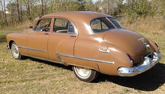
And here is a 1948 Olds 98.  At this time, GM's legendary styling director Harley Earl favored large-radius rounded shapes. This might have been residue from circa-1940 thinking that cars of the future would have highly streamlined, teardrop-derived shapes.  But such designs looked bulky, so Earl compromised, placing rounded shapes on an otherwise fairly lithe basic platform.  The 1948 98s featured flow-through front fenders and retained distinct rear fenders to avoid visual bulk.  Dropping the fender tops below the belt line also helped in this regard.  Note the continuity in grille shape and side trim.  This tactic preserved brand identity when body designs were discarded and replaced.

I've used this photo in several places because it shows what a fine design the fastback version of the C body was.

Another new feature was curved windshield glass.  The technology for reliable (low manufacturing breakage rates) mass-production of curved, shatterproof automotive glass was in its earlier stages, so '48 C bodes featured divided, rather than one-piece windshields.

The same applied to the rear window (or backlight, in styling jargon), as can be seen in this "for sale" photo.

Another sales photo, but of a restored Oldsmobile 98.  The split window seems to make an otherwise pleasing design slightly cluttered.  On the other hand, it helps define the car's vintage.  For example, when Hudson enlarged the back window opening of some of its 1950 models, it too used two-piece glass.

Jan 16, 2017

Baroque/Rococo Car Styling: Late 1950s and Now

Around 1955-60, American car styling was at the height of one of its periods of cumbersome shapes and elaborate decoration.  This was the result of the end of an evolutionary trend from cars being collections of discrete features to "envelope" bodies where fenders and other details were parts of comparatively simple overall shapes (see my book dealing with this in detail).  Casting about for new directions, American styling executives hit on the use of jet fighters and science fiction space ships as the basis for shapes and ornamentation.  This was further elaborated by the fad for sometimes arbitrarily placed two and three color paint schemes.

Reaction set in during the early 1960s when simpler designs reached the market.  But automobile styling has as much or more to do with fashion than functionalist ideological purity, so one can observe several swings between simple designs and elaborate ones.  For example, the 1970s saw American cars tending to the Rococo.  And the present auto scene is yet another round of styling ornamental overkill -- worse than in the '70s, rivaling the late '50s, and a worldwide practice to boot.

Gallery

Late 1950s Era

1958 Buick Super Riviera Coupe
General Motors' famed styling boss Harley Earl had run out of fresh ideas shortly before his retirement.  His 1957 redesigns for Oldsmobile, Buick and Cadillac were rounded and heavy looking compared to Virgil Exner's taut, tail-finned Chrysler Corporation line.  Because of the lead-time required for total redesigns, Earl ordered his staff to add lots and lots of chromed trim in a crash project as a means of making the unsuccessful 1957s more marketable for 1958.  The result was Rococo Bad Taste, as the Buick pictured above demonstrates.

1958 Oldsmobile Ninety-Eight Holiday Sedan
Like Buicks, '58 Oldsmobiles received a good deal of seemingly arbitrarily shaped and placed decorative trim.

1959 Chevrolet Impala Sport Sedan
The entire GM was redesigned for 1959, cars from all divisions sharing the same basic bodies.  The Chevrolet shown here had the thinner, less-rounder tops intended to make the cars seem less bulky than before.  But the late '50s tendency to flamboyance is obvious in the strange rear-end ensemble.

1960 Imperial - MJC Classic Cars photo
Meanwhile, Exner's Chrysler line's styling got increasingly overdecorated.  By 1960, the luxury Imperial brand was basically heavy and rounded with flabby tail fins and a fussy front end.

1961 Imperial
The final facelift of the Exner era saw the Imperial's fins enlarged slightly as well as being canted outwards and having a more pointed tail.  The frontal design is more angular, but decorative complexity was added in the form of detached headlight housings.

Recent Examples

2016 Toyota Prius front
Totyota's Prius was redesigned for 2016.  This was a time not long after Toyota management had been stung by criticism that the Toyota product line was too blandly designed.  So orders came down that in effect stated that the cars should be styled to be as un-bland as possible.  The result thus far has been a good deal of elaborate, confused angularity tacked onto wind tunnel tested basic bodies.

2016 Toyota Prius rear
Here too the added angularity is at odds with the underlying aerodynamic design.

2015 Lexus NX - two cars
Toyota's prestige Lexus brand is also beset by angular over-decoration, as can easily be seen on these Toyota RAV4 based compact SUVs.

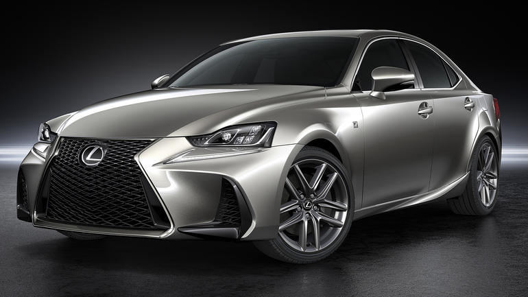
2017 Lexus IS 250
Here much of the middle part of the body is clean.  But the frontal design with its oversized air scoops and too-contrived back-to-back Lexus L grille shape is out of sync with the rest of the car.  The rear is not much better, but I'll let that pass for now.

2016 Nissan Murano
The aft end of this SUV is a confused jumble of excessive curves and angularities.

2014 BMW i3
This stubby all-electric car from BMW probably seems cute to some potential buyers.  My take is that the entire car is a visual mess.

2015 BMW i8
BMW's sporty electric car is more pleasing than the i3, yet is still over-decorated.  The top styling aft of the trailing door cut includes too much detailing in too cramped a space.  The black-painted areas add more busyness than is probably necessary, but were included (along with the flash of blue) to denote the "i" electric series  --  these traits are also seen in the previous photo.

Jan 12, 2017

1958 Ford La Galaxie Concept Begats Chrysler's Turbine Car

The late 1950s was a time when American car styling was at the height of one of its Baroque, (Rococo, even) periods.  The nub of this was use of jet fighters and science fiction space ships as the basis for ornamentation that was further elaborated by two and three colors paint schemes that were sometimes arbitrarily placed.

A reaction set in around 1960 when simpler designs began reaching the market.  And given the three or so years lead-time from sketchpad to production, stylists were probably thinking of simplification as early as 1957.

An example of incipient change might be the 1958 Ford Motor Company show car called La Galaxie.  It included some jet plane detailing, but lacked tail fins and a three-tone paint-job.

There are few decent photos of La Galaxie on the internet.  Some of the ones shown below had to be cleaned up, and still aren't top-drawer quality.


Headlight assemblies resemble jet fighter air intakes.  But the rest of the details seen from this angle are not from that source of inspiration.

Viewed from the side, La Galaxie's styling is fairly clean.  Much of that is due to the simple fender line and skirted rear wheels.  Visual boredom is reduced by the character line on the rear fender area and the decorative panel straddling the front wheel opening.  Note that the angle at its aft end is echoed  by the window sill interruption and the cut of the transparent roof panel.  For some reason, I've always been fond of the side window treatment of La Galaxie even though it's not practical for notional back seat passengers.

La Galaxie's rear aspect strikes me as being more science fiction inspired than jet fighter based.  Those huge "exhaust outlets" are out of scale to the rest of the car.  The continuation of the rear fender character crease into these zones helps tie the ensemble together, however.  The reverse-angle backlight (rear window) was a detail toyed with during the 1950s.  It saw production on 1958 Lincoln Continental Mk. IIIs, for example.
This low-quality image shows La Galaxie in color.

This is Elwood Engel, the man in charge of Chrysler Corporation styling.  In the 1950s he worked at Ford.  Behind him is the 1963 Chrysler Turbine Car powered by a gas turbine engine conceptually similar to those in actual jet fighters.  Around 50 Turbine Cars were built, many intended for testing by ordinary drivers.  Most were destroyed later.

The headlight housings have a jet-intake appearance in the same spirit as those on La Galaxie.

The aft end of the Turbine Car bears even closer resemblance to La Galaxie's.  The parts of the body between the ends is similar to some Ford Thunderbirds and Continentals.  The front and rear end designs make the Turbine Car impractical for normal use -- poor front protection and inconvenient trunk access at the rear.  But the true production killer was the impracticality of gas turbine engines for automobiles.  The jet fighter styling cues are appropriate for once, given the presence of the engine.