Reaction set in during the early 1960s when simpler designs reached the market. But automobile styling has as much or more to do with fashion than functionalist ideological purity, so one can observe several swings between simple designs and elaborate ones. For example, the 1970s saw American cars tending to the Rococo. And the present auto scene is yet another round of styling ornamental overkill -- worse than in the '70s, rivaling the late '50s, and a worldwide practice to boot.
Late 1950s Era
1958 Buick Super Riviera Coupe
General Motors' famed styling boss Harley Earl had run out of fresh ideas shortly before his retirement. His 1957 redesigns for Oldsmobile, Buick and Cadillac were rounded and heavy looking compared to Virgil Exner's taut, tail-finned Chrysler Corporation line. Because of the lead-time required for total redesigns, Earl ordered his staff to add lots and lots of chromed trim in a crash project as a means of making the unsuccessful 1957s more marketable for 1958. The result was Rococo Bad Taste, as the Buick pictured above demonstrates.
1958 Oldsmobile Ninety-Eight Holiday Sedan
Like Buicks, '58 Oldsmobiles received a good deal of seemingly arbitrarily shaped and placed decorative trim.
1959 Chevrolet Impala Sport Sedan
The entire GM was redesigned for 1959, cars from all divisions sharing the same basic bodies. The Chevrolet shown here had the thinner, less-rounder tops intended to make the cars seem less bulky than before. But the late '50s tendency to flamboyance is obvious in the strange rear-end ensemble.
1960 Imperial - MJC Classic Cars photo
Meanwhile, Exner's Chrysler line's styling got increasingly overdecorated. By 1960, the luxury Imperial brand was basically heavy and rounded with flabby tail fins and a fussy front end.
1961 Imperial
The final facelift of the Exner era saw the Imperial's fins enlarged slightly as well as being canted outwards and having a more pointed tail. The frontal design is more angular, but decorative complexity was added in the form of detached headlight housings.
Recent Examples
2016 Toyota Prius front
Totyota's Prius was redesigned for 2016. This was a time not long after Toyota management had been stung by criticism that the Toyota product line was too blandly designed. So orders came down that in effect stated that the cars should be styled to be as un-bland as possible. The result thus far has been a good deal of elaborate, confused angularity tacked onto wind tunnel tested basic bodies.
2016 Toyota Prius rear
Here too the added angularity is at odds with the underlying aerodynamic design.
2015 Lexus NX - two cars
Toyota's prestige Lexus brand is also beset by angular over-decoration, as can easily be seen on these Toyota RAV4 based compact SUVs.
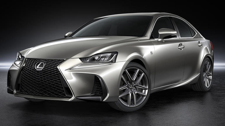
2017 Lexus IS 250
Here much of the middle part of the body is clean. But the frontal design with its oversized air scoops and too-contrived back-to-back Lexus L grille shape is out of sync with the rest of the car. The rear is not much better, but I'll let that pass for now.
2016 Nissan Murano
The aft end of this SUV is a confused jumble of excessive curves and angularities.
2014 BMW i3
This stubby all-electric car from BMW probably seems cute to some potential buyers. My take is that the entire car is a visual mess.
2015 BMW i8
BMW's sporty electric car is more pleasing than the i3, yet is still over-decorated. The top styling aft of the trailing door cut includes too much detailing in too cramped a space. The black-painted areas add more busyness than is probably necessary, but were included (along with the flash of blue) to denote the "i" electric series -- these traits are also seen in the previous photo.


Opinions are like aaa lips everyone has one!
ReplyDelete