Showing posts with label Stylists. Show all posts

Oct 6, 2016

When Giovanni Michelotti Might Have Been Inspired by Detroit

Giovanni Michelotti was a prolific Italian stylist, as is attested here.  In the 1950s he teamed with Enrico Nardi, helping to create two Lancia-based and Vignale-built concept cars, both named Raggio Azzurro (Blue-Ray).  Some information regarding the second car is here.

What I find interesting about both the 1955 and 1958 versions is how much they were influenced by American concept cars and styling fads of the time.  Not clear to me is how much Michelotti actually contributed in the way of design features.  That is because the American-inspired details are largely out-of-character for him.  I suspect that Nardi greatly influenced the completed designs.

Both Raggi Azzurro were on display at the Blackhawk Museum in Danville, California when I was there in March.  Below are some photos I took.  Their quality is hampered by the fact that the cars were jammed close to others and because the lighting in the gallery consisted of many small spotlights that are reflected by the cars' surfaces.

Gallery

The 1955 Raggio Azzurro as seen in a photo found on the Internet.  Conspicuously American features include the greenhouse, the two-tone paint and jet fighter inspired rear fenders.

Here is the 1955 Lincoln Futura concept car featuring the twin-bubble canopy theme that Michelotti seems to have borrowed for the greenhouse.  I have no information as to when in 1955 the Raggio was first displayed, but the Futura was announced around February (the March issue of Popular Mechanics Magazine, on news stands in February, has photos of it).  So there appears to have been time for the feature to be borrowed.

An interesting feature is the large headlamp mounted in the center of the grille.

The jet fighter (or space ship?) theme for the rear fender area is clearly seen here.

The bubble-type greenhouse viewed from the rear.  Note the right-hand drive, a feature of European luxury cars that was rapidly falling out of fashion in the 1950s.

The 1958 Raggio Azzurro probably photographed when nearly new.  No central headlight here; in its place is a Lancia shield.  The two-tone paint theme is close to that of the 1955 car, as are the character line above the rear wheel and the shape of the front fender.  The panoramic window is similar to those found on 1955-56 Chryslers.

Another early photo of the '58 Raggio Azzurro showing greater front end detail.


The '58 Raggio Azzurro has left-hand drive, making for easier driving in Italy and America.

The rear fenders are much more restrained than those of the 1955 car.  What we see here are fin-like extensions, yet another American cliché.

The main science-fiction aspect of the design is shown here.  I forgot to check if the apparent air vents at the rear of the B-pillar are functional.

Sep 29, 2016

Felice Boano's Classic Lancia Aurelia B20

I am far from alone thinking that Italian automobile design was at its zenith during the late 1940s and most of the 1950s.  One fine example is the Lancia Aurelia type B20 coupé built 1951-1958.  (Italian Wikipedia entry here -- you might need to have your computer translate.)

Styling was by Felice Mario Boano (1903-1989) whose career is dealt with on this Italian Wikipedia page.  As best I can tell, he was associated with Ghia at the time the B20 was designed, but since series production was planned, Ghia personnel were not involved beyond the prototype stage.  Before long, production was handed over to the Pininfarina firm.  Some minor modifications were presumably made later by Farina and not Boano.

Gallery

This is Boano's 1951 prototype B20.  A nice, trim Italian design that nicely blends the traditional vertical Lancia grille with the modern, "envelope" body.

The later 1951 Pininfarina pre-production prototype looks the same from this front three-quarter angle aside from the Farina badge on the front fender.  Some tail light details were changed from the Boano version.

Side view of a 1953 B20 berlinetta GT 2500.  The side window profile is yet another demonstration that BMW's famous shape was far, far from original.

Front view of a 1953 B20 berlinetta GT 2500.  The turn indicators are too close to the auxiliary air intakes that, in turn, should not have been so rectangular.  The edges of the openings nearest the grille should have been angled to match the grille's curves nearby.  The turn lights could then have been made square and placed at the outer edges of the intakes to form a unified composition.

Rear three-quarter view of what looks like a 1953 vintage B20.  What we see is basically a fastback design.  However, it ever-so-slightly flows in the manner of 1941-1948 Chrysler Corporation cars.  Very subtle: a unitary-curve fastback would have made the car look heavier if the trunk height at the rear was the same as shown.

Jun 20, 2016

Patrick Le Quément's Renault Mégane II

As this Wikipedia entry mentions, Renault has been producing a series of cars with the Mégane name since 1996.  The Mégane of interest to this post is the retroactively named Mégane II, in production from 2002 into 2009.

The Mégane II's design is one of those I strongly associate with Renault's powerful styling boss Patrick Le Quément (Wikipedia entry here).  It is quite similar in spirit to the Vel Satis concept car, and somewhat less so to the production Vel Satis.  I dealt with them here.

Le Quément in the early 2000s was trying to have Renaults look French, not as knockoffs of the increasingly internationalized style that was robbing cars of their origin-county identities.  He even made a point of hiring non-French stylists who he thought might understand a French look better than native French stylists -- analogous to fish not really understanding their watery environment.

Le Quément's French-look experiment eventually faded, and the 2009 Mégane IIIs had less quirky styling.  Nevertheless, the Mégane II (along with the Vel Satises) was an interesting approach to automobile design, as can be seen in the images below.

Gallery

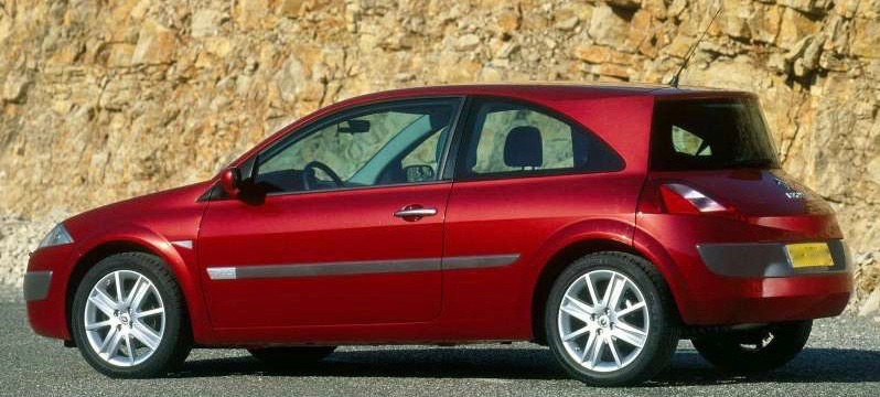
This view from above shows the Mégane's unusual shape most clearly.  The distinctive features are at the rear, and are the similar curves of the rear window, the strike panel (bumper) and character fold towards the bottom of the hatch.  These curves are not functional in a mechanical sense, instead functioning in a marketing sense.  That is, they are highly distinctive; I can't offhand recall anything quite like this on any other non-Renault production car.  (Some cars such as SUVs with station wagon (break) type bodies have rear ends that are curved in plan-view,  but in profile they are essentially vertical, unlike the Mégane II.)

The Mégane IIs front combines a curved overall shape with crisp details.  The lower air intake is disjointed from the above-the-bumper features.

Rear 3/4 view of a four-door Mégane II.  The aft side window, being part of the door ensemble, works much better here than in the two-door version shown in the image below.

The aft side window on two-door Méganes does not tie into the overall theme while seeming to somewhat restrict outward vision for rear-seat passengers.  For some inexplicable reason, Honda used a similar design on its 2007 CR-V crossover SUV line.

Another rear view.  A problem here is that the curved parts mentioned above do not blend very well with the rest of the car.

It happened that I rented a Mégane II in the fall of 2003, driving various places from Paris to Vienna and back.  Yes, it was quirky, but it did a good job.

May 19, 2016

1957 VW Redesigns by Strother Mac Minn and Bob Gurr

The November 1957 issue of Road & Track magazine included an article, "Beauty and the Beetle," showing how the Volkswagen Beetle might be redesigned.

As part of its introduction, the magazine stated: "To meddle with its basic beetleness could be heresy in the face of such success [VW sales were increasing strongly in 1957], unless the advantage and lessons of two decades of sheet metal packaging development [since the VW first appeared] could upgrade its position.  Going on the 'successful sales figures do not a perfect design make' premise, Road & Track felt that re-examination of the appearance might, at an appropriate time, help to perpetuate this standard of delightfully efficient motoring.  Two industrial designers were asked to participate."

Robert H. "Bob" Gurr (1931 - ) was trained at the Art Center School in Los Angeles, worked as a stylist at Ford, and then spent most of his career with the Disney organization.  Regarding his VW redesign, he wrote (in part) "Any new (improved) design would have to correct these [packaging] conditions but would be wise to retain the excellent structural principle of the backbone floor and unexcelled efficiency of sheet design.  Of course, the same engine, suspension, etc., should be used.  The accompanying illustrations show how all this could look if contained in a contemporary package layout.  The styling should be present-day 'acceptable' American design; not austere, and not a cute little designer's dream."

Strother MacMinn (1918-1998) worked at General Motors during the early part of his career, but most of it was as an instructor at the Art Center.  As for his VW redesign, "A more contemporary approach to body styling [as opposed to the beetle design] is one wherein the trunk, seating area, and engine compartment are joined or contained in a continuous 'pod' with a super-imposed 'greenhouse' for the occupants' heads, and the wheels project below for support.  Although the idea shown here is aimed at a world market, it is prejudiced toward an American point of view in which visible extended masses imply protection and 'more for the money.' ... The canopy (or cab) is intentionally reminiscent of Karmann-Ghia character as a contemporary recognition feature.  It also utilizes a graceful side-window outline to emphasize the profile and avoids the undesirable entrance compromises of a wrap-around windshield on a small car."

Click on the images below to enlarge.

Gallery


1957 Volkswagen - Barrett-Jackson photos

Rober H. Gurr Redesign
Aside from lowering the roof, Gurr kept his design to the same package as the Beetle (though note how the spare tire has been repositioned).  What we see here is shrunken 1955-vintage American styling (not so much 1957, I think).  The wrapped windshield and backlight give the greenhouse a cramped look, making the design seem even shorter than it is.

Strother MacMinn Redesign
MacMinn also reduced the height and might have increased the rear overhang (it's hard to be sure, given the perspectives he used in the renderings).  I think his redesign is much more successful than Gurr's.  That's because it retains a VW "feeling" or spirit.  It also has a more "timeless" appearance than Gurr's 1955-based design.

Sep 21, 2015

John Tjaarda's Streamlined Sterkenburg

1930s attempts at streamlined automobiles seldom fail to interest me.  The efforts were earnestly done, but limitations of engineering and materials states of the art in those days resulted in what to our eyes are quaint, awkward-appearing vehicles.

Not all of what are now called concept cars resulted in production models.  But perhaps the best-known successful concept-to-production evolution was from Briggs, whose lead stylist was John Tjaarda.  The resulting production car was the 1936 Lincoln Zephyr, a sub-luxury model that most observers credit with saving the upscale brand from extinction.  More information about this can be found here.

Along with streamlining, another popular avant-garde automotive concern during the 1930s and for a decade or two beyond was placing a car's motor at the rear.  I find this preoccupation puzzling because having the engine in the rear has few advantages and many defects.  So the notion that streamlined, rear-engine cars were the wave of the future was most likely the product of group-think rather than rational thought.

As it happened, Tjaarda's rear-engine Sterkenburg concepts (the name having to do with Tjaarda's ancestry and its lands near Utrecht in the Netherlands) evolved to the front-engine Zephyr.  This was a good thing.

Gallery

The 1936 Lincoln Zephyr, end-result of the concepts shown below.

Tjaarda (I think) posed by what seems to be his first Sterkenburg-type concept.  I do not know if it's an actual automobile or simply a body mock-up, though I suspect it's the latter.  Very low for its day and very racy towards its rear -- it would be appropriate for a 1930s pulp science-fiction magazine's cover art.  Assuming this is from about 1930, the strongly V'd windshield is also an advanced feature.  The front fenders are probably less aerodynamic than they look, and the separate headlight units are definitely drag-producers.

A running circa-1933 rear-engine prototype from Briggs.

Rear 3/4 view of the same car.

Tjaarda's patent drawings dated 1 November 1933 of the Sterkenburg displayed by Ford at the 1934 Chicago Century of Progress World's Fair.

The car on display.  It seems to be a facelifted, mockup version of the running prototype pictured above.

Another view of the Sterkenburg concept mockup.  Signs credit it as a Briggs product.


These are photos of a Briggs prototype with a front-mounted motor that appears to be an evolutionary step towards the '36 Zephyr.  Note that the front fenders flow over the rear-hinged (suicide) front door.  Flow-over fenders didn't reach production in America until the 1941 Cadillac Sixty Special appeared.  The grille-hood combination is not very different from that on the unsuccessful 1934 Chrysler and DeSoto Airflows.  When the Zephyr was launched, it featured a more conventional ship's prow grill designed by Bob Gregorie of Ford.