May 23, 2016

Confused Styling: 2015 Nissan Murano

A while ago I wrote about the three generations of the Nissan Murano, mentioning that I might have more to say regarding the most recent version.  That time has come, inspired by a glance at the rear of a Murano I noticed while driving in the Palm Springs, California area recently.

I suppose I should feel sorry for the stylists assigned to redesigning the Murano.  But they were in pretty much the same spot as stylists for other brands, having to deal with basic shapes dictated by government fuel economy regulation as played out by wind tunnel testing.  Like the others, their solution was to dress up that basic shape with all sorts of decorative details.

Where the Nissan crew went wrong, in my opinion, was that they created a disorganized mess of details, the only clear styling theme being that of confusion.

Side view.  The front section of the vehicle is a set of curves when seen in profile.  The side and rear are more linear and angular, aside from the area of the rear wheel.

The rear three-quarter view is where things fall apart design-wise.  The most fussy area is the C-pillar and the nearby tail lights.  What we seem to have here is a series of wedge-shapes flying off in different directions.  Worse, they are concentrated, crammed together in a small section of the body.  Immediately below the wedged tail light is a curve aft of the rear wheel opening, an echo of previous Murano styling.  This abruptly and awkwardly transitions to the rear surfaces that are a confusing blend of flattened arch-shapes and essentially horizontal lines.  This field of fussiness is emphasized by its contrast to the comparatively clean forward sides.


The frontal theme is more coherent, thanks to the angled elements creating a convergent effect.  This is somewhat counteracted by the headlight assemblies with their spikes or wedges pointing in different directions.  Note that the side-shoulder character line crease is the only really linear style feature and, in this image at least, it does not blend well with the rest of the ornamentation.

May 19, 2016

1957 VW Redesigns by Strother Mac Minn and Bob Gurr

The November 1957 issue of Road & Track magazine included an article, "Beauty and the Beetle," showing how the Volkswagen Beetle might be redesigned.

As part of its introduction, the magazine stated: "To meddle with its basic beetleness could be heresy in the face of such success [VW sales were increasing strongly in 1957], unless the advantage and lessons of two decades of sheet metal packaging development [since the VW first appeared] could upgrade its position.  Going on the 'successful sales figures do not a perfect design make' premise, Road & Track felt that re-examination of the appearance might, at an appropriate time, help to perpetuate this standard of delightfully efficient motoring.  Two industrial designers were asked to participate."

Robert H. "Bob" Gurr (1931 - ) was trained at the Art Center School in Los Angeles, worked as a stylist at Ford, and then spent most of his career with the Disney organization.  Regarding his VW redesign, he wrote (in part) "Any new (improved) design would have to correct these [packaging] conditions but would be wise to retain the excellent structural principle of the backbone floor and unexcelled efficiency of sheet design.  Of course, the same engine, suspension, etc., should be used.  The accompanying illustrations show how all this could look if contained in a contemporary package layout.  The styling should be present-day 'acceptable' American design; not austere, and not a cute little designer's dream."

Strother MacMinn (1918-1998) worked at General Motors during the early part of his career, but most of it was as an instructor at the Art Center.  As for his VW redesign, "A more contemporary approach to body styling [as opposed to the beetle design] is one wherein the trunk, seating area, and engine compartment are joined or contained in a continuous 'pod' with a super-imposed 'greenhouse' for the occupants' heads, and the wheels project below for support.  Although the idea shown here is aimed at a world market, it is prejudiced toward an American point of view in which visible extended masses imply protection and 'more for the money.' ... The canopy (or cab) is intentionally reminiscent of Karmann-Ghia character as a contemporary recognition feature.  It also utilizes a graceful side-window outline to emphasize the profile and avoids the undesirable entrance compromises of a wrap-around windshield on a small car."

Click on the images below to enlarge.

Gallery


1957 Volkswagen - Barrett-Jackson photos

Rober H. Gurr Redesign
Aside from lowering the roof, Gurr kept his design to the same package as the Beetle (though note how the spare tire has been repositioned).  What we see here is shrunken 1955-vintage American styling (not so much 1957, I think).  The wrapped windshield and backlight give the greenhouse a cramped look, making the design seem even shorter than it is.

Strother MacMinn Redesign
MacMinn also reduced the height and might have increased the rear overhang (it's hard to be sure, given the perspectives he used in the renderings).  I think his redesign is much more successful than Gurr's.  That's because it retains a VW "feeling" or spirit.  It also has a more "timeless" appearance than Gurr's 1955-based design.

May 16, 2016

Canada's Facelifted, Renamed 1950s Fords

During the 1950s Ford of Canada built what amounted to facelifted Fords, selling them under the Meteor brand at Mercury dealers.  Some background information is here.

Meteors were available for model years 1949-1961, inclusive.  My information regarding how styling was accomplished is nil, so speculation follows.  As can be seen below, until about 1960, Meteor styling -- ornamentation, actually -- often seems amateurishly done.  Ford of Canada was a separate entity on those years, the U.S. Ford being a stockhholder.  So I wonder if there was any kind of styling staff at all.  Given the appearance of 1949-59 Meteors, my guess is that engineering staff dealt with styling.

Below are images of Meteors paired with those of U.S. Fords for the same model years.

Gallery

1950 Meteor

1949 Ford
Fords for 1949 and 1950 had almost unnoticeable trim differences, and the same basically held for Meteors.  The Meteor grille for those years was adapted from Mercurys.

1951 Meteor - sales photo

1951 Ford
Whoever designed the 1951 Meteor facelift did a pretty good job.  I think it's at least on par with what Ford did, and might have been better if a medallion had been placed at the center of the grille.

1953 Meteor

1953 Ford
Meteors and Fords had little in the way of decorative differences for 1953.  For Meteor, a few chromes strakes on the faux side air scoop, raised chrome strips atop the front fenders, and revised details at the center of the grille.

1955 Meteor

1955 Ford
1955 Meteors had garish side trim (though Ford's was awkward) and a fussy, garish grille.

1956 Meteor

1956 Ford
More Meteor amateurism for 1956.  Grille and side trim are both awkward and garish.


1957 Ford
I always though 1957 Fords were nicely styled.  Meteors continued their 1955-56 overdone ways.

1958 Meteor

1958 Ford
For 1958, Ford and Meteor styling almost converged.  The main difference apparent here is some detailing on the middle of the grille opening.

1959 Meteor

1959 Ford
I never liked Ford's 1959 facelift and thought the slogan seen above was a joke.  Meteor featured a slightly different grille and a bit more side trim.

1960 Meteor

1960 Ford
On the other hand, 1960 Fords were perhaps the best-looking American cars for that model year.  The Meteor grill is nice, though I don't think those three four-pointed stars help it.  The flash on the side trim is mini-garish.

1961 Meteor

1961 Ford
By now Meteor seems to benefit from what looks to be professional styling.  Its grille is a little better than Ford's (except for those awful stars), and the rear treatment is a bit busy, yet interesting.

May 12, 2016

1940s Small-Backlight Convertible Tops

I've never liked the styling jargon term "backlight."  It refers to the rear window of an automobile, but taken more literally one would think of a light placed somewhere on a car's aft end.  Alas, I'll go along with the jargon, so be advised that this post deals with small rear windows (oops, backlights) found on American convertibles in the 1940s or thereabouts.

I am by no means knowledgeable regarding this detail, so what follows is speculation.

In the images below, you will notice that the convertible tops have rectangular, removable panels that house the small backlights.  Sometimes, convertibles would been driven with their tops up and the panels gone, perhaps to provide better ventilation on non-rainy days.  The reason for the small windows (and here I speculate) is that they were made of glass or a stiff piece of clear plastic for good vision to the rear.  Glass is heavy, and the canvas tops were not strong enough to support large windows.  So convertible backlights had to be small if they were glass or a heavy plasitc.  The downside to this is that small windows greatly restricted the driver's rear view.

Later convertibles tended to feature larger backlights made of thinner transparent plastics.

The following images are of cars offered for sale, usually at auctions.  Presumably, their convertible tops are of authentic design, even though they might be replacements for worn out originals.  I cannot  guarantee authenticity in all cases, however.  That said, what is striking is how similar the backlights are for so many brands over so many years.

Gallery

1940 LaSalle Series 50 Convertible - Auctions America

1940 Packard Super 8 Convertible - Barrett-Jackson

1941 Cadillac 62 Convertible - Barrett-Jackson

1948 Chrysler Town & Country - auction photo

1948 Lincoln Continental Cabriolet - Barrett-Jackson

1948 Cadillac 62 Convertible - Barrett-Jackson

1948 Packard Custom Eight Victoria Convertible - sales photo

1950 Hudson Commodore Six Convertible - Bonhams

1951 Mercury Convertible - Barrett-Jackson

May 9, 2016

The Archetypical Buick: Model Year 1952

It's more than a tendency, yet not an iron-clad rule: nevertheless, the greater the prestige and the higher its purchase prices, the more likely it is for an automobile brand to retain characteristic styling cues.  Think Rolls Royce, Mercedes Benz and Packard.

For much of its existence, General Motors' Buick was next-to-the-top make, slotted just below Cadillac in the firm's hierarchy of brands. Even so, it wasn't until the 1942 model year that Buick stylists under the leadership of GM's legendary Harley Earl established styling themes that have been carried over to the present -- though sometimes they were abandoned, only to be revived.

I wrote about putting some of these themes on a really small car here, and here I wrote about how Buick broke away from its signature grille theme (but later returned to it).

Buick's collection of styling details was strong during its heyday.  From 1942 through most of the 1950s, Buicks were easily recognizable to most people and not just car buffs.  Was there a model year where Buick themes were at their purest, where the cars might be considered archetypical Buicks?

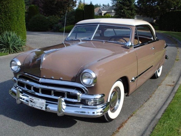
That is a matter of judgment.  Mine is that the 1952 Buicks were the most Buick-like.  Let's take a look the senior models, the Supers and Roadmasters, that had a different body than lower-priced Buick Specials (click on images to enlarge).

Gallery

The first three images are photos I took of a 1952 Buick Super Riviera a few years ago in the upper Napa Valley in California.  The swath of chrome along the side is what Buick called a Sweepspear, a strong Buick identifier.  On 1950-53 Buick bodies of the type shown here, it echoes the dropped front fender line.  It also recalls the fender line of 1942-48 Buick Roadmasters.  The Sweepspear was introduced on some 1949 models and carried through the 1958 model year.  Hints of it reappeared occasionally in later years.

Bold, vertical chromed "teeth" on the grille first appeared on 1942 Buicks.  They were dropped for 1955, but reappeared many times since, including recent years.  The hood sculpting that drops over the nose of the car and then helps frame the grille opening is a continuation of a practice (details differ) dating to the early 1930s or even the early 20s (if you squint your eyes and use your imagination).  This ended following the 1956 model year, perhaps because it was thought to look old fashioned and/or too decorative.

Rear portions of 1952 Buicks had little in the way of long-term iconic details.  However, the brake light ensemble on the trunk is a carryover from the mid-1930s (that was gone by 1954).  The sculpting on the rear fenders was found on 1950-53 Buick Supers and Roadmasters, but disappeared on the 1954 restyling.


Mecum Auctions photos of a 1952 Buick Super four-door sedan.

Another '52 Super four-door, this on a contemporary ad card.

A brochure spread showing 1952 Buick Roadmasters.

My reasoning for choosing 1952 as the archetypical year for Buick styling is as follows.  1950 Buicks featured large grille teeth that draped over the front bumper, a one-year-only affair that I wrote about here.  1951 Buicks were very similar to '52s, but Roadmasters had a swath of chrome aft of the Sweepspear that wasn't part of the theme: the 1952 version was more pure.  For 1953, Buick raised the central part of the front bumper, thereby diminishing the grille.  Also, headlights were grouped with turn indicator lights in the manner of the XP-300 show car.  This was continued for 1954, then dropped, so it can't count as being part of a long-lasting theme.  So 1952 is is.

May 5, 2016

Cadillac's Slowly-Changing 75 Limousine Line

Believe it or not, the market for limousines is not large.  Never was, actually.  So even General Motors chose to economize on limousine bodies back in the days when it was huge and prosperous.

In the years leading up to the U.S. entry into World War 2, General Motors marketed limousines by Buick (the Limited, model 90) and Cadillac.  Thereafter into the 1950s, only Cadillac had production limousines in its Series 75 line.

From the 1940 through the 1956 model years, Cadillac offered only two different limousine bodies, whereas there were four generations of its basic car lines.  As a result, Cadillac limousines were often stylistically out of phase with the regular line even though many ornamentation cues were incorporated where possible.  For model years 1957 and 1958 it appears that the greenhouse of the 1950-vintage limousine was grafted onto regular Cadillac bodies.

Gallery

1940 Cadillac Fleetwood 75 Limousine
This advertisement shows the limousine body introduced for the 1940 model year.

1941 Cadillac Fleetwood 75 Limousine
It was given the same '41 facelift as the rest of the Cadillac line.

1948 Cadillac 62
Regular Cadillacs were completely restyled for 1948.

1949 Cadillac 75 Limousine - Barrett-Jackson photo
But the 1940-vintage limousine body was used through the 1949 model year.  No attempt was made to facelift it to mimic 1948 styling cues.

1950 Cadillac 62
The Cadillac line was restyled for 1950.

1952 Cadillac 75 Limousine - sales photo
So was the limousine, as can be seen here in its 1952 guise.

1954 Cadillac 75 Limousine - Auctions America photo
The Cadillac line was restyled for the 1954 model year.  The limousine body in the passenger compartment zone appears to have been carried over from previous years.

1958 Cadillac DeVille
Cadillac was restyled for 1957 and facelifted in 1958.

1958 Cadillac 75 Limousine - via Wikipedia
The 1950-based limousine upper body continued through 1958.  Compare the passenger compartment roof and windows to the 1952 limousine shown two images above.