Jun 6, 2016

Citroën DS Critique

For many years, Citroën had the reputation of being an advanced-technology automobile maker.  This was certainly apt regarding its Traction Avant (front-wheel drive) model,  produced 1934-1957.

However, by the late 1940s, the most advanced feature of the Traction Avant was its front-wheel drive, the rest of the car looking distinctly old-fashioned.  Citroën and its Michelin owner were not about to rest on their laurels, setting out to create another technological sensation if they could.

The result was the DS series that entered production in 1955.  Styling was by Flaminio Bertoni, who I wrote about here.  The first of the series was the DS19, the 19 referring to its 1,911 cc motor.  The first link in this paragraph mentions the DS19s major technical innovations: I will focus on its styling.

Gallery

Here is a DS19 on display at a British auto show, not the 1955 Paris show where it made its debut.  Note that this example has right-hand drive.  The light colored car at the upper-right is a Rover.

Publicity photo of a 1956 DS19.  There is no grille to speak of, radiator cooling air entering from the lower part of the front end, a feature common today, but rare then.  DSs had a long 3,124 mm (123.0 in) wheelbase and short front and rear overhang.

Possibly the same car seen in the previous photo, this time apparently at an auto show.  The windshield has tight curve radiuses, so I wonder how much distortion drivers and front-seat passengers experienced.  Bertoni was a sculptural artist, so it is interesting how he treated the lower body, blending the hood with the sides.  I suspect that the high front fenders were dictated by legal requirements in some countries regarding headlight height above the ground, and wonder if Bertoni might have preferred a different treatment.

Rear three-quarter view.  Note the extremely short rear overhang, the rear wheels being placed nearly at the car's corners.  An odd touch is the lights placed at the ends of those tube-like chromed rain gutter formers at the edges of the top.  This seems like a weak copy of space ship and jet aircraft styling features found on many 1950s American cars.

The most striking interior feature was its steering wheel with only one attachment arm.

A publicity photo featuring pretty girls.  The DS had a tall greenhouse with plenty of glass area.  Making this visually even taller was the fact that the doors lacked window frames (though there was a slender B-pillar); see the top image for more detail.  The thin roof, the flat window glass (a technological limitation of the time), the tall greenhouse, the fairly upright windshield and the flat C-pillars combine to create a comparatively rigid form that contrasts with the curvy lower body.  Result: the Citroën DS19 is not a well-integrated design that seemed odd to me when first announced and still does not please me.

Jun 2, 2016

What Were They Thinking?: Jaguar XK150

The "What Were They Thinking?" post category here does not refer to Jaguar planners (essentially William Lyons himself) regarding the XK150, produced 1957-1962.  I'm thinking of the reaction of potential buyers and the public at large.

And at the time it was announced I was shocked, thinking it a bloated travesty of the classic XK120.  Road & Track magazine, the automotive bible of my youth, road tested the 150 Roadster in its September 1958 issue.  Its only comment regarding styling was: "Externally the 150 is still unmistakably an XK, but the general lines and appearance have been softened and refined.  More importantly perhaps, the seating position has been tremendously improved, the cockpit is roomier, controls are easier to operate and visibility is better."  I wonder if the fact that Jaguar had been placing ads on the back covers of R&T had anything to do with this mild reaction.

The November 1957 R&T (also with a Jaguar ad on the back cover) had a road test of a XK150 coupe, having this to say regarding styling: "Although observations on a test car's looks sometimes do not sit well with readers, here goes: The front end, a close examination of which discloses that every component has changed, retains its classic beauty.  The 'cab' has an appearance of lightness, correctly symbolizing the improved vision through the wider windshield and rear window.  Its 4-inch gain at shoulder height is too evident, reminding one more of a mature mother cat than a lithe young huntress.  The rear, heaven help us, needs customizing!  Its collection of chrome clutters the excellent basic shape.  (Letters will be answered as time permits.)"  Slightly more critical, but "nuanced" as political thinkers are wont to say these days.  The parenthetical "letters" comment suggests that R&T readers were letting the editors know that the 150s styling was controversial.

The August 1957 issue (Jaguar ad on the back cover) had a story announcing the XK150 coupe.  Its treatment was clinical, no judgment being placed on the styling.

The XK150 was essentially a new body on a slightly modified XK120/140 base.  Wheelbase and width were the same as the 120s dimensions or nearly so, the 150 being 4 inches (20 cm) longer, largely due to heftier bumpers.

Gallery

Jaguar XK120
The initial example of the XK sports car line.  A classic design.  I even approve of the spatted rear wheel openings.

Jaguar XK140 advertisement - 1956
XK140s got heavier bumpers and more chromed trim.  The spats disappeared for good, and the coupe's top was bulkier.  Altogether a slight, yet tolerable, degradation.

Jaguar XK150 Drop-Head Coupe
Fatter hood and curved windshield make the central body ponderous.  The raised fender line is more in line with mid-1950s styling fashions. But note the awkward curve of the front fender -- a lift over the wheel opening that reverses slightly to become a straighter path to the rear fender up-kick.

Jaguar XK150 Fixed Head Coupe
Even though the there is plenty of glass, the overall shape of the top seems a bit too heavy-looking.

1960 Jaguar XK150 Fixed Head Coupe - Barrett-Jackson photo
R&T was right regarding the rear-end ornamentation.  For example, the tail light assemblies could have been trimmed to align with the profile of the trunk and the vertical chromed strip should have been eliminated.  I think the rear window should have been a little less wide; the top's appearance would have been improved without significant degrading of outward visibility.

From the perspective of nearly 60 after its announcement, the XK150 doesn't irk me as much as it did when new.  Much of that has to do with the fact that the 120 has also receded from view (they're seldom seen on streets and roads these days) dulling my sense of comparison.  That said, the 150 is not a good design.  Bulky, with awkward detailing.  William Lyons surely abandoned his good taste with this one.

May 30, 2016

Side Trim Variations: 1956 Ford Line

Back in what some consider the glory days of the American automobile industry -- the 1950s -- there was for a few years a fad for two and even three colors for the same car.  Moreover, it seemed to be required that those different colors be splashed along the sides, separated by chromed strips of various sizes and shapes.

Two-tone paint jobs were around long before the 1950s.  Before "streamlining" and envelope bodies came on line, two-toning often took the form of fenders, valances covering the frame, and perhaps some other areas being painted black, the remainder of the body being in another color.  By the 1940s, the two-tone convention was that the "greenhouse" -- the part of the body above the "belt line" (roughly at, or just below, the lower edge of the windows) -- would be one color and the rest of the car another.

As noted, in the mid-1950s this convention had been abandoned and marketers were urging stylists to keep up with the competition by creating increasingly baroque color patterns.  Unlike nowadays, most brands were based on a single "platform" or basic body.  So stylists had what amounted to a single canvas to decorate using various color area patterns.

The present post features 1956 Fords.  The Thunderbird and station wagons aside, Ford offered three lines: the entry-level Mainline, the intermediate Customline and the top-level Fairlane.  Each had its side color/trim design.

Gallery

This shows the gamut of 1956 Fords (click to enlarge slightly).  The various lines are discussed below.

Top-of-the-line Fairlanes (named after Henry Ford's estate) carried over the 1955 checkmark color division pattern.  Proportions were altered and the horizontal segment was made wider with ribbing and other details added.  The white or cream color in this illustration covers the hood, trunk and part of the upper sides.

Customline Fords got a different color division design, though the roof and lower body (like the Fairlanes) received one color and the hood, trunk and upper sides another.  However another, traditional, color split was offered.  The green car at the lower left has a dark green top with the rest of the body painted light green.

Mainline Fords featured a variation of the Customline trim.  The upper part of the side trim on the large image above is part of the Customline package.  A lower horizontal chromed strip has been added to define an area of color matching that on the car's top.  The small images show one-tone paint jobs.  On these cars the secondary chromed strip just mentioned is absent.

This is a 1955 Mainline Ford, a bottom-of-the-line car from the previous model year when the two/three tone fad was less intensely followed.  Here there is no chromed side trim and the car is pained using only one color.

May 26, 2016

1941 Chrysler Thunderbolt Show Car

What we call "concept cars" were rare birds before around 1940.  This Wikipedia article contends that the 1938 Buick Y-Job was the first of that breed.  I'll have to think about that more deeply, but a case might be made that it was the first show car that publicized styling features planned or under consideration for future production.

Not long later, in 1941, Chrysler Corporation in cooperation with Briggs, the body manufacturing firm, announced its Newport and Thunderbolt show cars.  Aside from its integrated fender line, the Newport did little to predict future styling features.  The Thunderbolt, styled by Alex Tremulis, was a different story.  It incorporated "futuristic" details that were in the styling air at the time it was conceived.  Nevertheless, it was not an explicit effort to preview anticipated Chrysler design features.  So a show car it was.

Five Thunderbolts were built, and four are said to exist.  One was auctioned a few years ago by Southeby's RM Auctions.  Their web site has this detailed background information on Thunderbolts in general and the car being auctioned in particular.  An additional source that is well illustrated can be found here.

Gallery

Here is a photo that could have been used for publicity after the background drapery was airbrushed out.  The Thunderbolt featured through-fenders, vestigal rear fenders being a slight bulge.  No grille, air introduced to the radiator via openings below the front bumper -- this was virtually non-existent in 1941, but common today.  A detail slightly out of keeping with Tremulis' theme is the high, V'd hood.  I read someplace that this was necessary because the car used a tall, standard Chrysler radiator that a hoodline was required to clear.


Perhaps the Thunderbolt's most novel feature is its retractable, one-piece metal top.

A Thunderbolt publicity card, probably handed out at car shows where one was displayed.  Car-of-the-future features common around 1940 included enclosed wheels and those ribbed metal strips (a form of faux-streamlining "speed lines") along the sides.  Headlights are hidden, another futuristic cliché.

RM Auctions photo showing the aft end.  Until the 1950s, American stylists seldom did anything fancy with that part of a car; tail lights, a hood handle and a plaque with the car's name often sufficed.  Tremulis left the Thunderbolt's rear plain aside from the bumper that's actually an upside-down front bumper.

May 23, 2016

Confused Styling: 2015 Nissan Murano

A while ago I wrote about the three generations of the Nissan Murano, mentioning that I might have more to say regarding the most recent version.  That time has come, inspired by a glance at the rear of a Murano I noticed while driving in the Palm Springs, California area recently.

I suppose I should feel sorry for the stylists assigned to redesigning the Murano.  But they were in pretty much the same spot as stylists for other brands, having to deal with basic shapes dictated by government fuel economy regulation as played out by wind tunnel testing.  Like the others, their solution was to dress up that basic shape with all sorts of decorative details.

Where the Nissan crew went wrong, in my opinion, was that they created a disorganized mess of details, the only clear styling theme being that of confusion.

Side view.  The front section of the vehicle is a set of curves when seen in profile.  The side and rear are more linear and angular, aside from the area of the rear wheel.

The rear three-quarter view is where things fall apart design-wise.  The most fussy area is the C-pillar and the nearby tail lights.  What we seem to have here is a series of wedge-shapes flying off in different directions.  Worse, they are concentrated, crammed together in a small section of the body.  Immediately below the wedged tail light is a curve aft of the rear wheel opening, an echo of previous Murano styling.  This abruptly and awkwardly transitions to the rear surfaces that are a confusing blend of flattened arch-shapes and essentially horizontal lines.  This field of fussiness is emphasized by its contrast to the comparatively clean forward sides.


The frontal theme is more coherent, thanks to the angled elements creating a convergent effect.  This is somewhat counteracted by the headlight assemblies with their spikes or wedges pointing in different directions.  Note that the side-shoulder character line crease is the only really linear style feature and, in this image at least, it does not blend well with the rest of the ornamentation.

May 19, 2016

1957 VW Redesigns by Strother Mac Minn and Bob Gurr

The November 1957 issue of Road & Track magazine included an article, "Beauty and the Beetle," showing how the Volkswagen Beetle might be redesigned.

As part of its introduction, the magazine stated: "To meddle with its basic beetleness could be heresy in the face of such success [VW sales were increasing strongly in 1957], unless the advantage and lessons of two decades of sheet metal packaging development [since the VW first appeared] could upgrade its position.  Going on the 'successful sales figures do not a perfect design make' premise, Road & Track felt that re-examination of the appearance might, at an appropriate time, help to perpetuate this standard of delightfully efficient motoring.  Two industrial designers were asked to participate."

Robert H. "Bob" Gurr (1931 - ) was trained at the Art Center School in Los Angeles, worked as a stylist at Ford, and then spent most of his career with the Disney organization.  Regarding his VW redesign, he wrote (in part) "Any new (improved) design would have to correct these [packaging] conditions but would be wise to retain the excellent structural principle of the backbone floor and unexcelled efficiency of sheet design.  Of course, the same engine, suspension, etc., should be used.  The accompanying illustrations show how all this could look if contained in a contemporary package layout.  The styling should be present-day 'acceptable' American design; not austere, and not a cute little designer's dream."

Strother MacMinn (1918-1998) worked at General Motors during the early part of his career, but most of it was as an instructor at the Art Center.  As for his VW redesign, "A more contemporary approach to body styling [as opposed to the beetle design] is one wherein the trunk, seating area, and engine compartment are joined or contained in a continuous 'pod' with a super-imposed 'greenhouse' for the occupants' heads, and the wheels project below for support.  Although the idea shown here is aimed at a world market, it is prejudiced toward an American point of view in which visible extended masses imply protection and 'more for the money.' ... The canopy (or cab) is intentionally reminiscent of Karmann-Ghia character as a contemporary recognition feature.  It also utilizes a graceful side-window outline to emphasize the profile and avoids the undesirable entrance compromises of a wrap-around windshield on a small car."

Click on the images below to enlarge.

Gallery


1957 Volkswagen - Barrett-Jackson photos

Rober H. Gurr Redesign
Aside from lowering the roof, Gurr kept his design to the same package as the Beetle (though note how the spare tire has been repositioned).  What we see here is shrunken 1955-vintage American styling (not so much 1957, I think).  The wrapped windshield and backlight give the greenhouse a cramped look, making the design seem even shorter than it is.

Strother MacMinn Redesign
MacMinn also reduced the height and might have increased the rear overhang (it's hard to be sure, given the perspectives he used in the renderings).  I think his redesign is much more successful than Gurr's.  That's because it retains a VW "feeling" or spirit.  It also has a more "timeless" appearance than Gurr's 1955-based design.

May 16, 2016

Canada's Facelifted, Renamed 1950s Fords

During the 1950s Ford of Canada built what amounted to facelifted Fords, selling them under the Meteor brand at Mercury dealers.  Some background information is here.

Meteors were available for model years 1949-1961, inclusive.  My information regarding how styling was accomplished is nil, so speculation follows.  As can be seen below, until about 1960, Meteor styling -- ornamentation, actually -- often seems amateurishly done.  Ford of Canada was a separate entity on those years, the U.S. Ford being a stockhholder.  So I wonder if there was any kind of styling staff at all.  Given the appearance of 1949-59 Meteors, my guess is that engineering staff dealt with styling.

Below are images of Meteors paired with those of U.S. Fords for the same model years.

Gallery

1950 Meteor

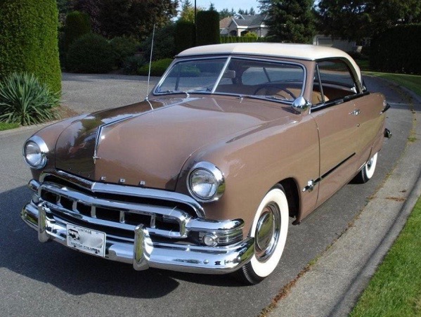
1949 Ford
Fords for 1949 and 1950 had almost unnoticeable trim differences, and the same basically held for Meteors.  The Meteor grille for those years was adapted from Mercurys.

1951 Meteor - sales photo

1951 Ford
Whoever designed the 1951 Meteor facelift did a pretty good job.  I think it's at least on par with what Ford did, and might have been better if a medallion had been placed at the center of the grille.

1953 Meteor

1953 Ford
Meteors and Fords had little in the way of decorative differences for 1953.  For Meteor, a few chromes strakes on the faux side air scoop, raised chrome strips atop the front fenders, and revised details at the center of the grille.

1955 Meteor

1955 Ford
1955 Meteors had garish side trim (though Ford's was awkward) and a fussy, garish grille.

1956 Meteor

1956 Ford
More Meteor amateurism for 1956.  Grille and side trim are both awkward and garish.


1957 Ford
I always though 1957 Fords were nicely styled.  Meteors continued their 1955-56 overdone ways.

1958 Meteor

1958 Ford
For 1958, Ford and Meteor styling almost converged.  The main difference apparent here is some detailing on the middle of the grille opening.

1959 Meteor

1959 Ford
I never liked Ford's 1959 facelift and thought the slogan seen above was a joke.  Meteor featured a slightly different grille and a bit more side trim.

1960 Meteor

1960 Ford
On the other hand, 1960 Fords were perhaps the best-looking American cars for that model year.  The Meteor grill is nice, though I don't think those three four-pointed stars help it.  The flash on the side trim is mini-garish.

1961 Meteor

1961 Ford
By now Meteor seems to benefit from what looks to be professional styling.  Its grille is a little better than Ford's (except for those awful stars), and the rear treatment is a bit busy, yet interesting.